Running with Data
fun with data, music, and visualization
This project is maintained by jsundram
streamgraph.js
Streamgraphs are cool. They’re great at displaying trends in data over time, similar to a stacked graph, but much prettier. The first one I saw was Lee Byron’s Last.fm Listening History graphic, a beautiful poster showing trends in the music he had listened to over the course of two years. The New York Times used an interactive streamgraph (created by Matthew Bloch and Shan Carter) to great effect to show box office receipts over 22 years in The Ebb and Flow of Movies.
When Lee Byron & Martin Wattenberg open-sourced their streamgraph implementation in Java and Processing, I was pretty excited. I’ve been playing around with processing.js a lot lately, so I decided to port their code.
I’ve posted the code on github. The algorithms are much the same as Byron & Wattenberg’s, but I’ve added code to make the graphs more interactive and easily configurable.
The major things I added are:
- Dynamic sizing (sized to fit the Canvas element it’s on).
- Settings. These can be dynamically changed, and easily set outside of the streamgraph code.
- Zoom. You can click and drag to zoom in, and press Escape to zoom out.
- Hover. The selected layer changes color, and the active layer name and data point is displayed at the top of the screen.
- Color. Another color option that offers a bit more variation.
- Examples (including the original beautiful examples).
Streamgraph.js doesn’t quite have feature parity with the interactive flash streamgraph shown in The Ebb and Flow of Movies, but I would like it to get there. I’m waiting for the text handling in processing.js to catch up to what’s available in Processing. The processing.js team is moving fast, so I think it will happen soon.
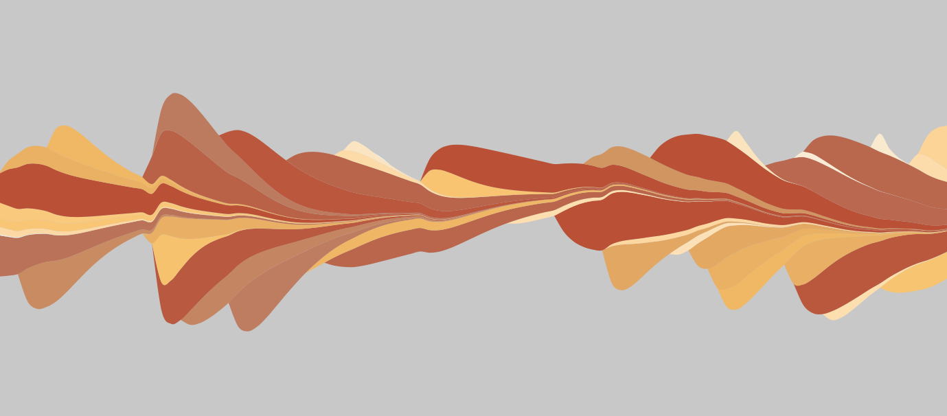
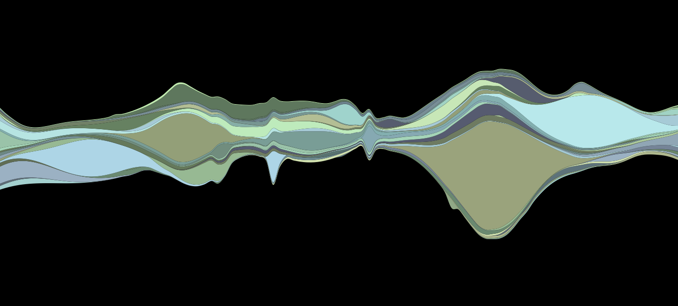
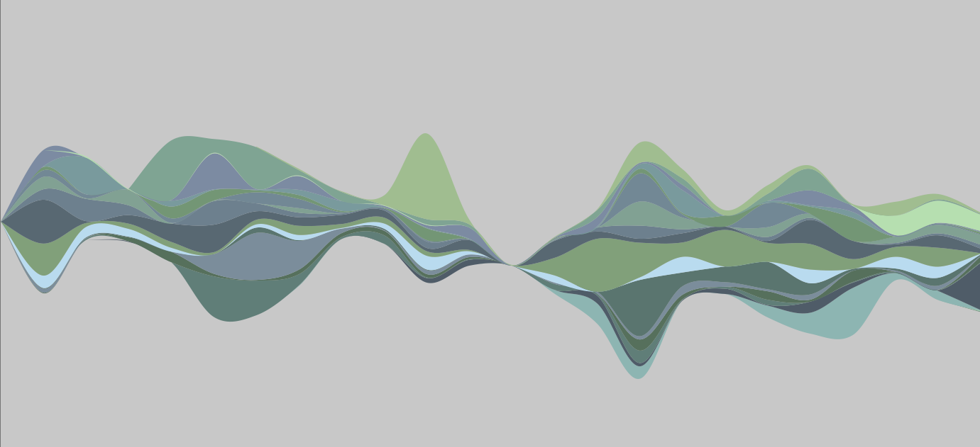
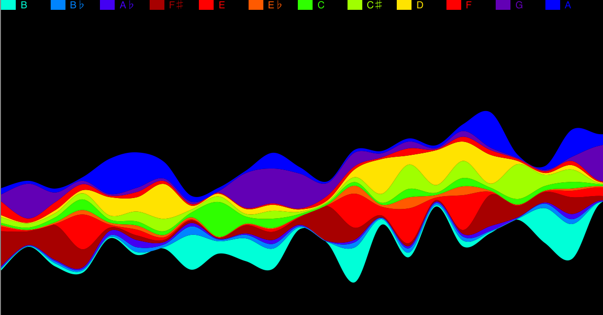
Here are some screenshots of streamgraphs.js in action. Full source for these examples is on github.
 Byron & Wattenberg’s Late Onset example
 Byron & Wattenberg’s Believable example, using a more varied color set.

@reiddraper’s last.fm listening data for top 20 artists over 2 years.

Pitch data from part of the Goldberg Variations, obtained using The Echo Nest’s Track API. Note the legend and the custom coloring: a mapping of pitch frequencies onto wavelengths of light.
Get the code: streamgraph.js on github
Originally published: Sun, 02 May 2010 to https://runningwithdata.tumblr.com/post/566345323